
Introduction
Look, if you’ve ever stared at one of those words that reads the same upside down and wondered “how’d they pull that off?” – you’re about to find out. Better yet, you’re gonna make your own in about two minutes.
No Photoshop needed. No art degree required. Just this tool and whatever word’s bouncing around in your head.
Check out our best Stylish name generator for free.
How to Use Our Ambigram Generator
Alright, enough backstory. Let’s make something.
Everything updates in real-time here. You type, it changes. You pick a new color, boom, done. No sitting there clicking “generate” like it’s 2005.
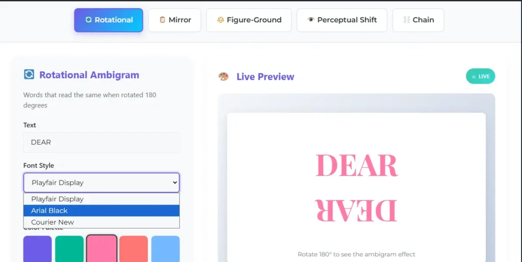
Step 1: Pick Your Style
Five options across the top:
Rotational is your classic flip-it-upside-down type. Start here if it’s your first rodeo.
Mirror does the reflection thing – hold it up to a mirror, and it still works.
Figure-Ground gives you two words in one design. One word in the black letters, another in the white spaces. Trippy stuff.
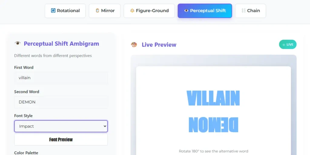
Perceptual Shift shows different words when you flip it. ANGEL becomes DEMON, that sort of thing.
Chain makes your letters flow in a circle or wave. Think infinity symbol made of actual text.
Step 2: Type Your Word
Just start typing. That’s literally it.
But here’s the thing – shorter is way better. Aim for 4-6 letters when you’re starting. Every letter you add makes the whole symmetry thing exponentially harder.
Good starter words: NOON, MOM, SWIMS, WOW
Bad starter words: SOPHISTICATED, ENCYCLOPEDIA, anything ridiculously long
For Figure-Ground and Perceptual Shift, you’ll see two text boxes since those need contrasting pairs like LOVE/HATE or DARK/LIGHT.
Step 3: Choose Your Font
Click that dropdown and try different fonts. Each one completely changes the vibe.
Playfair Display is fancy and elegant. Arial Black is bold and chunky – great for readability. Impact basically yells at you. Courier New has that typewriter feel.
The preview updates instantly when you switch. Sometimes a word that looks terrible in one font suddenly clicks perfectly in another. Fonts make a huge difference.
Step 4: Pick a Color
Ten color options (except Figure-Ground, which stays black/white because that’s how the visual illusion works best).
Click any color circle and your ambigram changes instantly. We picked colors that stay readable even when flipped or mirrored.
Going for a tattoo? Black or dark gray. Tattoo artists need high contrast.
Making something for Instagram? Go wild with the bright purple or cyan.
Designing a logo? Select whatever fits your brand, ensuring it remains readable at small sizes.
Step 5: Watch the Live Preview
That big panel on the right? That’s exactly what your final design looks like. Not some approximation – the actual thing.
Every change you make shows up immediately. No lag, no loading, no clicking, generate and hoping. The “LIVE” badge means what it says.
Try rotating your phone or tilting your screen to see how the ambigram reads from different angles. When you find a word that works both ways perfectly, it’s pretty satisfying.
Step 6: Download Your Design
Once you’ve got something you like, hit one of those download buttons.
PNG = better quality, transparent background. Use this for posting online or layering in designs.
JPG = smaller file. Use this for printing or emailing to a tattoo artist.
Both are high resolution – 600×350 pixels for most styles. That’s sharp enough for screens or printing.
What is an Ambigram?
An ambigram is a word that messes with how you see things. Most common type? You write something, flip the page 180 degrees, and it still reads identically. Or sometimes it shows a totally different word.
Take NOON. Write it normally, turn your paper upside down – still NOON. The letters just work that way naturally. But here’s where it gets nuts: some designers can make “ANGEL” read as “DEMON” when you flip it. Same design, different words depending on which way you’re looking.
Douglas Hofstadter coined the term “ambigram” back in the 80s, but people have been doing this forever. There’s this ancient square from Pompeii (yeah, volcano city) that’s basically a 2000-year-old ambigram. So this isn’t new – we’ve just gotten better at it.
You probably recognize these from Dan Brown’s “Angels & Demons.” That whole book featured ambigram designs and kind of brought them mainstream. Now people get them tattooed, use them for logos, engrave them on jewelry – anywhere you want something visually interesting with that “wait, what?” factor.
The 5 Types of Ambigrams Explained
Rotational Ambigrams
The classic. Design a word that reads the same (or reveals something different) rotated 180 degrees.
Some letters naturally look similar upside down. N flipped is still basically N. The letter S rotates into itself. Z works both ways. Smart designers like John Langdon exploit these natural symmetries to create stunning ambigrams.
The real magic? Slightly modifying letterforms to work in both directions. That curve at the top of an A forms the bottom of a V when flipped. Pretty clever.
Best for: Tattoos (put it on your forearm and rotate your arm to show both readings), anything where you want an immediate wow factor.
Try: NOON, SWIMS, MOM, or contrasting pairs like HOPE/FEAR, FAITH/DOUBT.
Mirror Ambigrams
These work with reflection instead of rotation. Design text that looks correct normally AND when you hold it to a mirror.
Uses horizontal symmetry. Letters like A, H, I, M, O, T, V, W have built-in symmetry down their center. String them together cleverly, and you’ve got a mirror ambigram.
The clothing brand New Man has a perfectly mirrored logo. Once you notice it, you can’t unsee it.
Best for: Logos and branding. Imagine a storefront sign readable from inside AND outside. Or business cards that work either way.
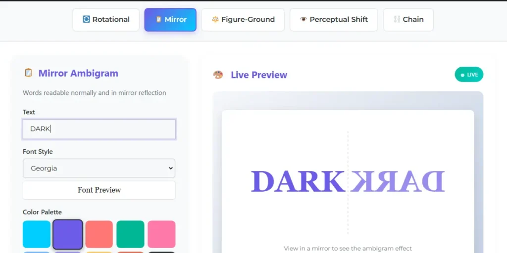
Figure-Ground Ambigrams
Brain-bender territory. One word shows in the black letters, and a different word appears in the white negative space.
Remember those optical illusions where you see either two faces or a vase? Same concept, except both readings are intentional words.
Best for: Meaningful tattoos. LIGHT in black letters with DARK in white spaces – that whole duality vibe. Also, conceptual art with philosophical themes.
Common pairings: LOVE/PAIN, GOOD/EVIL, HOPE/FEAR, PEACE/WAR. Contrasting concepts where the relationship adds meaning.
Perceptual Shift Ambigrams
Similar to rotational, but specifically shows different words. ANGEL right-side up becomes DEMON upside down. SMILE becomes FROWN.
Plays with how your brain interprets shapes. Same curves and lines form different letters depending on orientation.
Best for: Representing transformation, dual nature, before/after concepts, personality contrasts.
Chain Ambigrams
Letters connect in a continuous flow. Each letter bleeds into the next seamlessly.
Three pattern options:
Circle – perfect ring shape
Wave – flowing horizontal pattern
Spiral – expands outward from the center
No clear start or end point. Like the ouroboros but made of text.
Best for: Wedding bands, circular tattoos around arms or ankles, band logos. Keep it short – 4-6 letters work best.
Real-World Uses for Ambigrams
Tattoos That Actually Mean Something
Ambigram tattoos have exploded lately. Walk into any decent tattoo shop – they’ve done them.
The appeal? A regular text tattoo just sits there. An ambigram is interactive. Rotate your arm to show both readings. Built-in conversation starter.
Common choices: Names combined (your name plus your partner’s name working both ways), duality concepts (LOVE/HATE being most popular, also FAITH/FEAR), transformations (BROKEN/HEALED, LOST/FOUND), family tributes (FAMILY/FOREVER).
Placement matters big time. Forearms are ideal because you can easily show both orientations. Some people do them on ribs for larger pieces. Ankle work for smaller designs. Upper back or chest for statement pieces.
One critical thing – bring your downloaded design to a professional tattoo artist, but understand they’ll probably need to tweak it slightly. What works on screen doesn’t always translate perfectly to skin. Lines might need to be thicker, and curves might need adjustment. A good artist knows this and will guide you.
Logos and Business Branding
An ambigram logo pretty much guarantees people remember your brand.
Saw a business card once that was an ambigram. You could hand it upside down by accident, and it still reads correctly. That attention to detail sticks with people.
Works great for:
- Creative agencies (shows you’re creative, obviously)
- Wellness and yoga studios (play into balance and duality)
- Tech startups (demonstrate innovation)
- Restaurants with contrasting concepts (breakfast/dinner places)
Just make sure your ambigram works at small sizes. Test it on a business card before committing to your entire brand identity. Some designs that look amazing at poster size become unreadable at 1 inch.
Personal Art Projects
Wedding invitations with couples’ names as ambigrams. Anniversary gifts with “LOVE” are designed to also read “ALWAYS” when rotated. Birthday cards that reveal different messages depending on how you hold them.
Print your ambigram large, get it framed, and hang it somewhere prominent. Instant conversation piece. Guests will stand there, tilting their heads, trying to figure it out.
Musicians use them for album covers. Authors use them for book covers. Artists incorporate them into larger works. The applications are literally endless.
Social Media Content
Here’s something wild – ambigrams absolutely kill it on social media.
Post a regular image? Scroll, scroll, scroll. Post an ambigram? People stop. They tilt their phone. They zoom in. They spend time engaging with your content. And that engagement is gold for algorithms.
Instagram especially loves ambigrams. People save them, share them in stories, and tag their friends. They’re infinitely shareable because they’re both visually interesting AND interactive.
Try this: create an ambigram of your brand name or a relevant word, post it on Instagram, and watch your engagement metrics. It’s a cheap trick, but it works. Want to take it further? Use our free word cloud generator to visualize what words dominate your brand content before designing your ambigram.
Tips for Making Better Ambigrams
Start Simple, Seriously
Your first ambigram shouldn’t be “Supercalifragilisticexpialidocious.” Start with NOON or MOM, or WOW.
Why? Every additional letter multiplies complexity. A 4-letter ambigram has to balance 4 letters. An 8-letter one needs 8 letters that all cooperate. The math quickly becomes your enemy.
Start short. Master the basics. Then gradually try longer words as you get a feel for which letters work well together.
Letters Are Not Created Equal
Some letters are your friends in an ambigram design. Others actively work against you.
Great letters for rotational ambigrams: H, I, N, O, S, X, Z (these have natural symmetry)
Okay letters: M and W (they flip into each other), B and D (same deal)
Nightmare letters: F, G, P, Q, R (these require serious design gymnastics to work rotated)
This is why SWIMS makes such a clean ambigram, but PERFECT is a nightmare.
For mirror ambigrams, look for letters with vertical symmetry: A, H, I, M, O, T, U, V, W, X, Y.
Test Both Orientations
Don’t just admire your ambigram right-side up. Actually, flip your phone or tilt your monitor and check if it reads clearly upside down, too.
A successful ambigram is 50/50 – meaning both orientations work equally well. If one direction looks great but the flipped version is barely readable, keep tweaking fonts and text until you get that balance.
Bonus: check our best Character name generator tool.
Contrast Is Your Friend
Black on white. White on black. These classic combinations work for a reason – maximum readability.
For digital designs, you can experiment with colors. But for tattoos? Stick with high contrast. Tattoo artists need clear, bold lines to work with. Subtle color variations and low contrast don’t translate well to skin.
The same goes for logos that need to work at small sizes. The more contrast, the better your ambigram will read when it’s tiny on a business card.
Keep It Clean
I see people adding flourishes, decorative elements, swirls, all kinds of embellishments to their ambigrams. Don’t.
The beauty of an ambigram is in the letterforms themselves. Adding decorative elements usually just obscures the design and makes it harder to read.
Keep it simple. Keep it clean. Let the ambigram itself do the talking. You can always add decorative elements in post-processing if you really want them, but the core ambigram should be pure and uncluttered.
Frequently Asked Questions
What’s the best word length for an ambigram?
Four to eight letters. That’s the sweet spot. Shorter than four, and you don’t have much to work with. Longer than eight and you’re fighting an uphill battle with complexity.
The absolute easiest? Four to five letters. Start there. Once you’ve made a few successful ambigrams at that length, you can try pushing to six or seven letters. But honestly, most professional ambigram designers stick to shorter words because they know longer doesn’t mean better – it usually means less readable.
Can I use these designs commercially?
Yeah absolutely. Everything you create with this tool is yours. Use it for your business logo, sell merchandise with it, get it tattooed on paying clients, whatever. No licensing fees, no attribution required (though we appreciate it if you want to shout us out).
We’re not going to show up with a lawsuit because your coffee shop is using an ambigram you made here. That’s not how we operate.
Which type works best for tattoos?
Rotational ambigrams dominate the tattoo world. They’re easy to demonstrate – just rotate your arm or leg and boom, different reading. Most tattoo artists are familiar with them at this point.
Perceptual shift ambigrams are also popular for tattoos with deeper meaning. The whole “one thing becomes another” concept resonates with people.
Figure-ground ambigrams can work, but they need to be larger to maintain clarity. Those negative-space effects require some size to pull off properly.
Download your design in PNG format with black color for the clearest reference for your tattoo artist.
Do I need Photoshop or design skills?
Nope. Zero. None. That’s the entire point of this tool.
If you can type and click buttons, you can make an ambigram. The live preview shows you exactly what you’re getting. No surprises, no hidden complexity, no need to understand design principles or typography or any of that stuff.
Why do some words work better than others?
Letter structure. That’s the whole game.
Words with naturally symmetrical letters (H, N, O, S, I, X, Z) create cleaner ambigrams. Letters with similar heights and widths balance better visually. Understanding basic typography principles can significantly improve your ambigram designs.
This is why NOON is stupidly easy as an ambigram – every letter cooperates naturally. Meanwhile, something like SOPHISTICATION is basically impossible because the letters are working against each other.
Are ambigrams a modern invention?
Not at all. While Douglas Hofstadter coined the term in the 1980s, palindromic word puzzles have existed for centuries. The Sator Square from Pompeii, dating to before 62 CE, is one of the earliest known examples of this type of symmetrical wordplay.
Start Creating Your Ambigram Now
So that’s everything. You know what ambigrams are, how they work, how to make them, and what to do with them once you’ve got one.
The tool is sitting right above this. You don’t need to sign up. No email to verify. No credit card to enter. You can just type something and watch what happens. For more tools, visit our home page.
Try a few different words. Experiment with fonts. Click some colors. See what works and what doesn’t. The live preview makes it basically impossible to mess up because you see everything in real-time.
Whether you’re designing your next tattoo, creating a logo for your business, making art for your wall, or just exploring this weird corner of typography that most people don’t know exists, you’ve got everything you need right here.
Go type something in that box up there. Your ambigram is waiting.